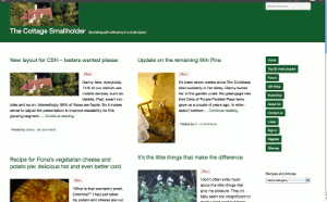
New layout for CSH – testers wanted please
Posted by Fiona Nevile in Cottage tales | 89 comments
Photo of our Cottage Smallholder cottage from the air
Danny here, everybody.
14% of our visitors use mobile devices, such as tablets, iPad, smart mobiles and so on. Interestingly, 85% of those are Apple.
So it makes sense to adjust the presentation to improve readability for this growing segment while ensuring that users of normal computers and laptops remain unaffected.
The site looks very different since we made the switch at 07:30 this morning but the content remains the same.
We would very much welcome comments here on this article from mobile device users and “normal” computer users alike. Even if it’s just to say “looks fine on my xyzsuperwotsit” or “the buttons are way off the screen on my abcamazatron”.
Desktop and laptop users can partly simulate what it looks like on a smaller screen device by making your browser window smaller and resizing it by dragging the edges. If you don’t know how to do that then don’t worry. It is not necessary to try it.
Edit: Friday May 11
Some visitors have observed unusual manifestations!
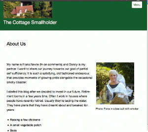
Here are three screenshots – thank you very much,Celia -from a Mac laptop . .
These are intended to give you an idea about how the site should appear. If it looks different on your browser then plaease tell us. Obviously it will be different on small screen devices.
Update Sat May 12: Well, I have to concede that this new theme/layout is simply not good enough, as many of you have pointed out.
It does not work on IE8 and looks horrible on a screen width of 1024 (thanks, Simon). Those two factors alone mean that over 20% of our visitors either cannot get onto the site or have a bad experience.
Thank you very much to everybody who took the time and trouble to test it out and leave a comment with feedback. A true community effort!
Today I will research better alternatives, so expect some more changes but then we stop changing, hopefully, for the next six years.
Update Mon May 14 2012
This theme/layout that we installed on Saturday is far better. It will take a few days to get it working and looking exactly as we want but so far so very good.
Leave a reply


@ Adam:
“I assumed they were indented because they were part of the œAbout Us section”
Yes, it was intentional but foggy’s comment made me think again. It did look a bit stupid.
Veronica – don’t you realise that “raggedy” is the new “aligned”? 🙂
The buttons are intended to be left-justified/aligned but the width is governed by the button text.
Interesting about your Chrome observation. That Menu button should appear top right only when the screen width is too narrow to display the vertical column of navigation buttons.
Thanks very much and I look forward to more observations when you have the time.
Re: foggy’s comments. Actually, I see that too on the MacBook Pro – I assumed they were indented because they were part of the “About Us” section. But when I look on the iPad and iPhone there’s no indent.
Sorry, but it looks a bit of a mess on my Mac (in both Opera and Firefox). There’s a raggedy column of buttons down the right hand side. In Chrome, there’s a “Menu” link at the top that when clicked jumps to a list of links at the bottom. Very odd. I have to go out now, but I’ll post some screenshots later.
Thanks, foggy. Got that straightened out now.
Excellent. Thanks for testing, Sophie.
Looks fine on my android phone and my mac with safari.
I’m on a Mac, Danny, and the last 4 of the green buttons on the right (Listen to Register) are slightly out of line with the top 7.
Thank you very much, Jenny and Adam.
That’s very reassuring because we don’t have the Apple devices that you were able to try out for us. So it was a teeny bit tense until you kindly sent your feedback.
And thanks, Adam, for the OS specifics. Could be useful if some OSs respond poorly.
Looks very clean and slick on my iPhone (using Atomicweb and Safari), my MacBook Pro (using Firefox) and my iPad (Atomicweb)
This looks just fine on my Mac and my iPod. Hope this helps!