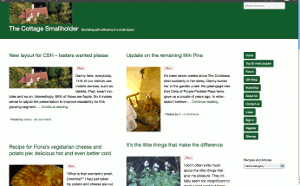
New layout for CSH – testers wanted please
Posted by Fiona Nevile in Cottage tales | 89 comments
Photo of our Cottage Smallholder cottage from the air
Danny here, everybody.
14% of our visitors use mobile devices, such as tablets, iPad, smart mobiles and so on. Interestingly, 85% of those are Apple.
So it makes sense to adjust the presentation to improve readability for this growing segment while ensuring that users of normal computers and laptops remain unaffected.
The site looks very different since we made the switch at 07:30 this morning but the content remains the same.
We would very much welcome comments here on this article from mobile device users and “normal” computer users alike. Even if it’s just to say “looks fine on my xyzsuperwotsit” or “the buttons are way off the screen on my abcamazatron”.
Desktop and laptop users can partly simulate what it looks like on a smaller screen device by making your browser window smaller and resizing it by dragging the edges. If you don’t know how to do that then don’t worry. It is not necessary to try it.
Edit: Friday May 11
Some visitors have observed unusual manifestations!
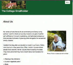
Here are three screenshots – thank you very much,Celia -from a Mac laptop . .
These are intended to give you an idea about how the site should appear. If it looks different on your browser then plaease tell us. Obviously it will be different on small screen devices.
Update Sat May 12: Well, I have to concede that this new theme/layout is simply not good enough, as many of you have pointed out.
It does not work on IE8 and looks horrible on a screen width of 1024 (thanks, Simon). Those two factors alone mean that over 20% of our visitors either cannot get onto the site or have a bad experience.
Thank you very much to everybody who took the time and trouble to test it out and leave a comment with feedback. A true community effort!
Today I will research better alternatives, so expect some more changes but then we stop changing, hopefully, for the next six years.
Update Mon May 14 2012
This theme/layout that we installed on Saturday is far better. It will take a few days to get it working and looking exactly as we want but so far so very good.
Leave a reply


Danny – I’m here again – sorry to disappoint!! -V-
🙂 🙂
Just think of all the experience and knowledge you are gaining 🙂
This has been an interesting experience for Danny and me 🙂 When we saw what the screen looked like at 1024 wide we just wanted to crawl away and die! We have found a new theme with a responsive screen size that looks good on all screen sizes. A mazerati compared to this clunky Ford model T of a theme!
Thanks for all your help and support. Much appreciated as always!
All – your extremely useful feedback has prompted us to drop this theme / layout.
No more horrible screens, raggedy buttons and vertical menus.
Back to the drawing board.
Simon, I tried it on my laptop at the nearest resolution to yours 1024 x 768 and it does look nasty. It’s something I should have tested early on but it did not occur to me.
My normal resolution is 1280 x 768 so the extra 250 or so pixels obviously make a dramatic difference.
Mandi – not sure if you are seeing it as it was intended to look but all feedback is valuable, so thanks.
Edit
I took a look at the stylesheet and it has four different appearances depending on screen width. Let’s see if we can make it better for the 1024 width.
/* smartphones in landscape mode */
@media screen and (min-width: 480px) {
/* tablets in portrait mode */
@media screen and (min-width: 768px) {
/* tablets in landscape mode */
@media screen and (min-width: 1024px) {
/* standard laptop screens */
@media screen and (min-width: 1220px) {
Hi Danny
Try setting your screen to 1024 x 600. Thats the resolution of my netbook screen.
If it did look like your screen shot it would be great but sadly it doesn’t.
Good luck and keep up the good works.
Simon
hi sorry to be a kill joy but on my bog standard windows 7 hp laptop it looks .. dare i say cheap ..nasty.. and like something someone who has had about 4 hrs on the internet and decided to start a blog would attempt to throw together… but then thats just me I hate change 🙁
All – I added some screenshots to the original article above to illustrate what the site SHOULD look like in a laptop or desk top computer.
Thanks to Celia for sending me screenshots from her Mac.
I was very impressed this afternoon when Fiona showed me how the site appeared on her little Samsung mobile phone. Looked quite good TBH.
I have problems with it on IE8 as well, crashes my browser at work when I try to load the website, serves me right for trying to get my fix at work I suppose. Works fine on my laptop at home. Bit of confusion with the two posts side by side, no distinction between the B&Q post and the asking for testers post but otherwise fine.
Mhairi – it seems like you and I both work for organisations that have not yet approved IE9.
On my corporate laptop I use IE8 only for company shared folders and workspaces because have to. For personal browsing I use Opera now – used to use Firefox in the past but it gets sooo slow.
Point taken about the confusion between articles when there is no visual divider.
Many thanks,
D
Hi Danny! Just want to let you know that the layout of the ‘Manage Subscriptions’ page is off. In fact it’s nigh on impossible to click the tick box and the button to turn a particular subscription off. I had to refresh the page about ten times before I managed to click the box and select the button before an overlay of links went over the module and made it inactive.
Crikey, Tanya, it’s like a spider’s web of rubbish, isn’t it?
It looks like two add-on that we don’t use have suddenly sprung to life of their own accord on that page only.
I will sort it out this evening.
Thanks again,
D