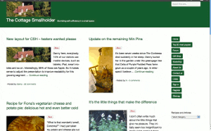
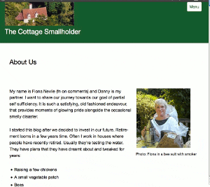
New layout for CSH – testers wanted please
Posted by Fiona Nevile in Cottage tales | 89 comments
Photo of our Cottage Smallholder cottage from the air
Danny here, everybody.
14% of our visitors use mobile devices, such as tablets, iPad, smart mobiles and so on. Interestingly, 85% of those are Apple.
So it makes sense to adjust the presentation to improve readability for this growing segment while ensuring that users of normal computers and laptops remain unaffected.
The site looks very different since we made the switch at 07:30 this morning but the content remains the same.
We would very much welcome comments here on this article from mobile device users and “normal” computer users alike. Even if it’s just to say “looks fine on my xyzsuperwotsit” or “the buttons are way off the screen on my abcamazatron”.
Desktop and laptop users can partly simulate what it looks like on a smaller screen device by making your browser window smaller and resizing it by dragging the edges. If you don’t know how to do that then don’t worry. It is not necessary to try it.
Edit: Friday May 11
Some visitors have observed unusual manifestations!
Here are three screenshots – thank you very much,Celia -from a Mac laptop . .
These are intended to give you an idea about how the site should appear. If it looks different on your browser then plaease tell us. Obviously it will be different on small screen devices.
Update Sat May 12: Well, I have to concede that this new theme/layout is simply not good enough, as many of you have pointed out.
It does not work on IE8 and looks horrible on a screen width of 1024 (thanks, Simon). Those two factors alone mean that over 20% of our visitors either cannot get onto the site or have a bad experience.
Thank you very much to everybody who took the time and trouble to test it out and leave a comment with feedback. A true community effort!
Today I will research better alternatives, so expect some more changes but then we stop changing, hopefully, for the next six years.
Update Mon May 14 2012
This theme/layout that we installed on Saturday is far better. It will take a few days to get it working and looking exactly as we want but so far so very good.
Leave a reply


I use an iPad and it looks great. Very inviting and slick. I’ not sure if you’ve made changes since yesterday but it looks quite different and much better. I must say too that you seem very proficient with you technology. I’ve had a few entertaining moments with some other sites where clearly self sufficiency skills outdoors considerably outweigh on line skills! Though wont stop visiting just because of that.
Many thanks I love this site and it helps to lower stress levels after a hard day.
Sounds good, Dawn. Thanks.
Yes, we installed a new layout yesterday lunchtime. I have been tweaking it since then and it’s not quite 100% yet.
The regulars on here – in the forum – do have a good giggle and 30 minutes of reading always cheers me up no matter how horrible the day has been.
LOL. I’ve just twigged what I’m doing wrong! The newer/older comments bit means after I see it above and then I reopen it my comment is on another page which I’m not used to. Perhaps the £1.40 bottles of wine should be kept for cooking after all! All clear now anyway.
Karen – what substances did you bring back from France? 🙂
Thanks for the positive comment and be grateful that you missed all the excitement!
Oh now it’s reappeared above!
Hmm I’ve left a comment under the post re the £50 B&Q prize to say that I left a post here and on that blog and it appeared above. I then went on the back arrow and they disappeared. When I submitted the 2nd comment on the B&Q post the 1st one reappeared but I’ve come back to this one and my comment is still missing! Don’t know if it will reappear when I submit this? It was just to say all fine now at this end. Thank you
Oops that should read thank you for not ‘or’
Eek I’ve been away in France for 10 days and have just come to catch up the posts. At 1st I thought I’d accidentally stumbled on the CSH forum but went back to a post I recognised and confirmed that I was on the blog. It did look strange at 1st but only compared to what we’ve been used to. you’ve obviously sorted out all the glitches because it’s as easy to read and use as before. It’s just our poor old brains that have to get used to the different layout – then we’ll barely remember the old way. Thank you or going to the trouble of keeping it up to date and user friendly. I have Firefox too btw and Windows 7 (I think or Vista – I have 1 on my laptop and the other on my desktop and can’t remember which is which)!!
The blog is now looking really neat Danny, Well done.
Cheers, Simon. Moving in the right direction.
Simon – actually you are correct. I had tried a free theme/layout originally and spent 10 days trying to tweak it before I decided to buy one (the bad one!) and spent another week on that.
So when it came to tweaking this current one, I found that I knew more or less what to do for 70% of requirements.
BTW, the tech support from these people is second to none. 30 mins response time on a Sunday morning.
@ Val – so pleased the doormen accepted your story and let you back in! 🙂 Great to see you again.
@ Veronica – it’s a relief. Eventually it became a no-brainer on Sat morning to dump the wrong’un based on the feedback here.
It’s still a WIP and I agree that the green is too green, even for an Irishman!
I will chip away at all the relatively minor errors and improve the appearance over the next few evenings.
Never knew you were THAT polite 🙂
Thanks again.
Phew! It’s looking better on my Mac now. Raggedy buttons gone! A more logical and cleaner layout. I think the green of the navbar is a bit … green 🙂 But that’s a minor criticism. I’m just glad to see the back of that other theme. My opinion was similar to Mandi’s but I was too polite to say so 🙂